This post features a sample band 9 task 1 pie chart answer and examiner feedback.
Below is a writing task 1 pie chart question on the changing populations of two countries over time. This post will include:
- example question
- checklist
- structure
- sample answer
- examiner’s report
You should try to answer the question before reading the sample answer and then compare what you have written. You can ask me any questions about this post on the IELTS Advantage Facebook Page.
Question
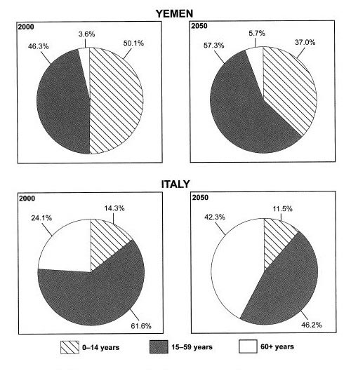
The charts below give information on the ages of the populations of Yemen and Italy in 2000 and projections for 2050.
Summarise the information by selecting and reporting the main features, and make comparisons where relevant.

Source: Cambridge English IELTS Past Papers.
Checklist
In order to answer this task effectively, we need to ask ourselves some questions beforehand. Below is a checklist which shows you how I think about IELTS writing task 1 chart questions.
- What kind of chart is it? This is a pie chart and we will, therefore, have to use different language sometimes as compared to other charts. For example, with pie charts, we are more likely to use the language of proportions. See my task 1 grammar guide for more information.
- What does the title say about the chart? The title gives us all the basic information we need to answer the question. We should read this at least twice to make sure we fully understand the question.
- What information is contained on both axes? There are no axes in this question because it is a pie chart.
- What are the units of measurements? The units of measurements are principally ages and percentages. We will, therefore, have to use specific language for percentages.
- What groups are compared? There are two countries (Yemen and Italy) and three age groups.
- What is the time period? This is very important because it will affect the tense we use. There are two different time periods- 2000 and 2050. We will, therefore, have to use past and future tenses.
- What is the most obvious thing that the data shows you? The two most obvious things are that Italy had a much older population than Yemen in 2000 (or Yemen had a younger population) and both populations are predicted to be much older in the future.
- What is the most important or significant piece of information displayed? The fact that Yemen has a very small proportion of people over 60.
- Can any comparisons be made? Yes, the observations we made in points 7 and 8 above.
- Is it a static chart or dynamic chart? There are four static charts but put together and they are dynamic i.e. it changes over time and this will be reflected in the language you use.
I am not suggesting that you write these ten questions out in the exam, it would take too long, however, I do tell my students to use this checklist when they are practicing. If you think about the ten things above, you have a much better chance of answering the question effectively. If you practice enough, you will mentally ask yourself these questions every time you answer a task 1 IELTS question.
Structure
For pie charts, I advise my students to use a simple four paragraph structure.
Paragraph 1
Sentence 1- Paraphrase question
Paragraph 2
Sentence 1- Overview of first main feature.
Sentence 2- Overview of second main feature.
Paragraph 3
2-3 sentences detailing first main feature.
Paragraph 4
2-3 sentences detailing second main feature.
Task
Try using the checklist and structure above to try and answer the question before looking at the answer below. This is a really useful exercise because you will identify the areas you need to work on and make mistakes. Fixing them is the key to success in IELTS.
Answer
The pie charts compare the proportions of Italian and Yemeni citizens in three age groups in 2000 and projections for 2050.
It is clear that Yemen had the younger population in the year 2000, and the same is predicted for the year 2050. The populations of both countries are predicted to get older over the 50 year period.
In 2000 just over half the Yemeni population were under 14, compared to just over 14% of Italians in the same age group. Only a very small percentage of people in Yemen were over 60 at 3.6%, in contrast to nearly a quarter of the Italian population. The largest group for Italy was the 15-59-year-olds with just over 60% while Yemen had 46.3% of its population in this category.
Yemen’s average age is set to increase with the proportion of over 60s increasing by just over 2% and the middle group rising by 11%, leaving the youngest group with a decrease of nearly 13%. It is envisaged that by 2050 the number of people in Italy over 60 will jump to 42.3%, the percentage of those in the youngest bracket will drop to 11.5% and the share in the middle category will decrease to 46.2%.
Examiner’s Report
The answer addresses the task, reporting the main features and reporting enough detail for the reader to be completely informed. Very clear comparisons are made between the two countries throughout the essay. A very clear overview is given that gives a general picture of both countries, all age groups and both times. The information is very well organised with good linking phrases such as ‘in contrast to’, ‘respectively’ and ‘It is envisaged’. Vocabulary is wide-ranging and accurate with words such as ‘Yemeni’, ‘bracket’, ‘category’ and ‘proportion’. Data is described well with words and phrases such as ‘over half’, ‘just over’, ‘jump to’ and ‘drop to’ put to good use. The range of grammatical structures is both wide-ranging and accurate with past, present and future tenses used effectively.

