Below is a sample Task 1 question on line graphs. It uses the following structure.
Paragraph 1
Paraphrase question
Paragraph 2
Overview of 2 main features. You will notice that I have included no numbers and used very general language.
Paragraph 3
Details of the first main feature. Here I have gone into more detail about the first general point I mentioned in the previous paragraph.
Paragraph 4
Details of the second main feature.
You will notice that I have written a lot more about the first feature. I did this because I think the most used fuels and more significant. You will also notice that I shortened ‘Quadrillion units’ to ‘q’. This is acceptable if you tell the examiner this by putting it in brackets, as I have done.
Task
Don’t look at the answer yet try to do the question without any help and then compare it with my answer.
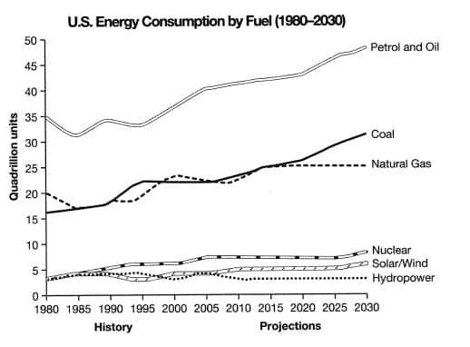
The graph below gives information from a 2008 report about energy consumption in the USA since 1980, with projections until 2030.
Summarise the information by selecting and reporting the main features and making comparisons where relevant.
Source: Cambridge English IELTS Past Papers.
The line graph shows energy consumption by fuel type in the United States from 1980-2008, with projected use until 2030.
Overall, fossil fuels have been the dominant type and will continue this trend into the future. Nuclear and renewable energy sources have represented a small but significant proportion of total energy use, and despite small projected gains, they are projected to continue doing so.
Petrol and Oil command the biggest share with 35 quadrillion units (35q) in 1980, rising to approximately 40q in 2008, and this trend is set to continue with a projected value of nearly 50q in 2030. In 1980 natural gas and coal came in second and third, with around 16q and 20q, respectively. However, coal overtook natural gas in 1990 and, despite some fluctuation, is set to be the second most used fuel in 2030 with just over 30q. It is predicted that natural gas will level off and remain relatively constant at about 25q.
Nuclear and renewable energies all represented around 4q in 1980 and fluctuated up until 2008. It is speculated that nuclear energy will reach 10q by 2030 and solar/wind around 5q, with hydropower dropping and then remaining constant at approximately 2q.
I hope you have found this useful and if there are other questions you would like me to answer, just let me know in the comments section below.
For a more detailed post, visit how to answer IELTS task 1 chart questions.
You may also find my grammar guide for IELTS task 1 useful. It has lots of phrases to help you describe data.

